Summarize this article with
Fingerprinting is a way to identify website users without using cookies or data storage. Instead, device properties like language and installed fonts are used to create highly accurate, unique identifiers that work even if the browser has incognito mode turned on.
A common misconception is that disabling JavaScript can prevent fingerprinting. Since advertisers and bad actors use it for ad targeting and tracking your online activity, it’s a natural (albeit incorrect) assumption that disabling JavaScript will protect you against fingerprinting. In this article, we will demonstrate that fingerprinting can occur even in the absence of JavaScript.
Check out the demo to see it in action:
The demo should show the same fingerprint, even if visitors attempt to conceal their identities using the following methods (among others):
- Requesting desktop mode in mobile browsers
- Spoofing the user agent
- Using incognito mode
- Changing the internet connection
These are just a handful of the many use cases where fingerprinting can uniquely identify devices, even as other methods fail.
How the demo works
When you open the main page of the demo, your browser sends several HTTP requests to the demo’s server automatically. The list of requests and the request contents depend on your specific device and browser (more on this later). The server extracts meaningful pieces of data — or signals — from the HTTP requests and stores them in a database. Your device signals stay the same as you visit different websites and subsequently can be used to reliably identify and track you over time.
The server links the requests of a single visitor together using a unique random token by inserting this token into the main page’s HTML code. As a result, all HTTP requests from the main page contain the token, and different visitors requesting the main page receive unique pieces of HTML code.
Here’s a simplified example of how this works:
function getMainPageHTML() {
  const token = makeRandomString()
  return `<html>
  <body>
    <img src="/image/${token}" />
    <iframe src="/frame/${token}"></iframe>
    <a href=”/result/${token}”>See the fingerprint</a>
  </body>
</html>`
}
Your fingerprint is shown on a separate page. The URL contains the token as well. The server finds your signals using this token, calculates a hash sum using all of the signals, and returns the result to the browser (the hash sum is the fingerprint).
In our demo, the page is placed inside an iframe to make the fingerprint viewable on the main page, but keep in mind that the server can access the fingerprint behind the scenes, at any moment.
No-JavaScript signal sources
The following is a list of signal sources that don’t require JavaScript; however, not all signals listed are included in the demo, largely due to their low contribution to accuracy or inherent instability.
IP address (not included in demo)
The server receives your IP address with every HTTP request. Typically, IP addresses are unique but are considered unstable: when your underlying internet connection changes (e.g., from Wi-Fi to cellular) or VPN is turned on, your device IP address changes as well. For this reason, IP address is not used as a signal in the demo.
HTTP headers
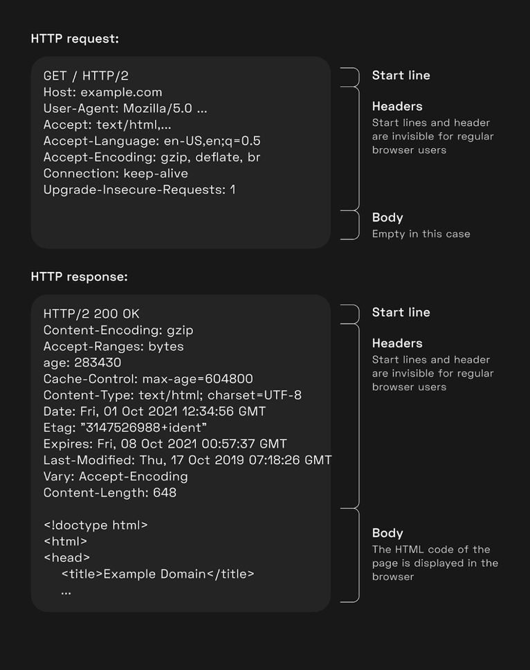
HTTP headers are a part of every HTTP request and response — they come before the body (i.e., the payload) and consist of name/value pairs separated by colons. This meta information enables better communication between the browser and the server. Some HTTP request headers contain information about the user’s browser settings. The demo uses these header values as signals.
The following illustration depicts a browser HTTP request and a server HTTP response when a user visits example.com:

You can view the headers under the Network section of your browser’s development toolbox. Browsers send these headers with every HTTP request; in turn, the backend can parse signals from these headers from any HTTP request, including the request for the main page.
User-Agent (not included in demo)
This HTTP header signal contains detailed information about the browser version, operating system, and other device-related information. This header value is considered unstable, as mobile browsers alter it when a desktop version of the website is requested. Additionally, Safari provides an easy way to change the user-agent value and many privacy-related browser extensions spoof the user-agent. For these reasons, user-agent isn’t used in the demo.
Accept
Browsers use this HTTP header value to tell servers what file types are supported.
For example:
Accept: text/html,application/xhtml+xml,application/xml;q=0.9The file types supported depends on the browser engine and version. Browsers send different header values for different types of resources (e.g., webpages, images, stylesheets, video and audio). The demo makes individual requests to get Accept header values for each resource type:
<html>
  <head>
    <link rel="stylesheet" href="/headers/(token)/style" />
  </head>
  <body>
    <img src="/headers/(token)/style" />
  </body>
</html>
No separate request for the web page header is needed because browsers send the header with the request for the main page.
The demo doesn’t use <audio> and <video> tags, since media requests aren’t made when the page is invisible; if these tags were used, the page would produce a different fingerprint when visible. Also, the Accept header value for audio/video requests never changes in a single browser engine.
Accept-Language
This HTTP header value tells the server what languages the client prefers. For example:
Accept-Language: en-GB,en-US;q=0.9,en;q=0.8,ru;q=0.7Google Chrome only sends one language in incognito mode, so the demo uses the first language as a signal.
Accept-Encoding
This HTTP header value advertises which content encoding (e.g., compression algorithm) the browser is able to understand and varies with browser engine/version. For example:
Accept-Encoding: gzip, deflate, brClient Hints (not included in demo)
Client Hints are special HTTP headers. Browsers don’t send these by default — if the server responds with an Accept-CH header, the browser will add the Client Hints to future requests to this website. For example, this response header makes browsers send a Device-Memory and a Sec-CH-UA-Full-Version header:
Accept-CH: Device-Memory, Sec-CH-UA-Full-VersionCurrently, only Google Chrome and other Chromium-based browsers support this header. Chromium browsers don’t send Client Hints when JavaScript is disabled, thus Client Hints aren’t used in the demo.
CSS
The demo collects several signals using the browser’s CSS engine. All the CSS signals work the same way: the page’s CSS code determines whether or not to send an HTTP request based on the browser, OS, device, and other parameters. In general, the CSS code for a signal looks like this:
<div class="css_probe_42"></div>
<style>
  magic-query .css_probe_42 {
    background: url('/signal/(token)/(signalName)');
  }
</style>
If your browser matches the magic-query CSS selector, it will apply the background style to the <div> tag and make an HTTP request to download the background image (with the URL /signal/(token)/(signalName)). The server will then save this information in the database. If your browser doesn’t match the selector, the server will treat the absence of a request as a signal as well. css_probe_42 is a random class name for a signal, as every signal must have a unique class name.
The magic selectors used in the demo are described in the following section.
Feature queries
A special CSS rule called @supports applies CSS styles only if the browser supports the given feature. Different browsers vary in terms of their features, so these can be used to tell browser engines apart.
This is CSS code that will only trigger an HTML request in Chromium-based browsers:
@supports(-webkit-app-region: inherit) {
  .css_probe_42 {
    background: url(...);
  }
}
Other features (in place of -webkit-app-region) used in the demo include:
-moz-appearancedetects Firefox and other browsers with the Gecko engine-apple-pay-button-styledetects Safari-webkit-touch-calloutdetects any iOS browser-moz-osx-font-smoothingdetects macOS Firefoxaccent-colordetects modern Chromium (version 93+) and Gecko (version 92+) browsers. Since Tor uses an outdated version of Gecko, the absence of this feature indicates that the browser is most likely Tor.
Media queries
@media is a CSS keyword that enables the application of CSS styles based on various conditions outside the page. In general, CSS code with a media query looks like this:
@media (feature: value) {
  .selector {}
}
If the feature matches the value, the interior CSS code is applied to the page. A feature may have multiple possible values, so the demo can produce various HTTP requests depending on the feature value. The browser either makes one of the requests, or none at all.
This is what the CSS code looks like in general:
<div class="css_probe_42"></div>
<style>
  @media (featureX: value1) {
    .css_probe_42 {
      background: url('/signal/(token)/featureX/value1');
    }
  }
  @media (featureX: value2) {
    .css_probe_42 {
      background: url('/signal/(token)/featureX/value2');
    }
  }
  /* ... */
</style>
The demo uses the following media features:
hoverandany-hoverindicate whether the device allows users to hover over HTML elementspointerandany-pointerindicate whether the device has a pointing device (e.g., a mouse) and how accurate it is.colorindicates whether the device’s screen supports colors and how many bits are used in a single color channel of the screencolor-gamutdenotes the color space the device’s screen is capable offorced-colorsindicates whether the browser is set up to restrict the color paletteinverted-colorsindicates whether the operating system inverts the screen colorsmonochromeindicates whether the screen is monochrome — either naturally or because of operating system settingsprefers-color-schemeindicates whether the user has chosen the light or the dark theme in the operating system settingsprefers-contrastindicates whether the user has asked the system to increase or decrease the amount of contrast between adjacent colorsprefers-reduced-motionindicates the user’s preference in having less motion on the screendynamic-rangeindicates whether the display supports HDR
The next set of features are a bit trickier: device-width, device-height and -webkit-device-pixel-ratio reflect the resolution of the whole screen and its pixel density. The values of these features are arbitrary — you can write CSS code that has a @media rule for all the thousands of possible values, but it will only add unnecessary bloat to your code base. Instead, the demo checks ranges of values using the min and max rules.
Below is an example of how to detect screen width:
@media (max-width: 349.99px) {
  .css_probe_42 { background: url('/signal/(token)/screenWidth/,350) }
}
@media (min-width: 350px) and (max-width: 999.99px) {
  .css_probe_42 { background: url('/signal/(token)/screenWidth/350,1000) }
}
@media (min-width: 1000px) and (max-width: 2499.99px) {
  .css_probe_42 { background: url('/signal/(token)/screenWidth/1000,2500) }
}
@media (min-width: 2500px) {
  .css_probe_42 { background: url('/signal/(token)/screenWidth/2500,) }
}
More range entries with narrower values will result in a higher degree of precision.
The screen width and height values of an Android device will swap when it’s rotated from portrait orientation to landscape, and vice-versa. In order to preserve the fingerprint, the demo swaps the values in order to make the width always be smaller than the height.
Fonts
Operating systems have a myriad of different built-in fonts; additionally, desktops systems typically allow users to add their own custom fonts. It’s impossible to retrieve a list of all the user’s fonts without JavaScript (and the user’s permission), but it is possible to check whether a specific font is installed.
A CSS rule called font-face adds a custom font for use on the web page. The rule includes a set of font names to search the device for and a URL of the font file. If an installed font with the given name is found, the browser will use it; otherwise it will download the font file from the specified URL. For this reason, the server can make the determination that the font is missing if the URL has been requested. For example:
<div style="font-face: 'Helvetica';">a</div>
<style>
  @font-face {
    font-family: 'Helvetica';
    src: local('Helvetica'),
         url('/signal/(token)/fontHelvetica')
         format('truetype');
  }
</style>
The demo uses the following fonts:
RobotoandUbuntuare available on Android and ChromeOSUbuntuis available on UbuntuCalibriandMS UI Gothicare available on WindowsGill SansandHelvetica Neueare available on macOSArimois available on ChromeOS
As you can see, installed fonts are an effective way to tell operating systems apart.
Conclusion
Disabling JavaScript doesn’t prevent your device from being fingerprinted, as most browsers will still leak an abundance of data such as IP addresses, behavior patterns, and more. And since most websites require JavaScript to function properly, using this method to preserve your online privacy will invariably lead to a suboptimal web experience.
Special browsers like Tor guarantee anonymity and the exact same fingerprint across all users; for those that take privacy to the extremes, this may be the only option.
- Star, follow, or fork our no JavaScript fingerprinting demo
- Email any questions you have to oss@fingerprint.com
- Join our Discord channel to discuss all things Fingerprint, cybersecurity, and privacy related
- Join our team and work on exciting research in device security: work@fingerprint.com


